January 2021 has been a busy, exciting month which has seen the unveiling of our new remote learning platform as well as the launch of 46 fantastic new school and trust websites. Congratulations to all of our customers who went live in January!
Let's take a look at a selection of this month's Latest Lives:
January 2021
Greenshaw Learning Trust
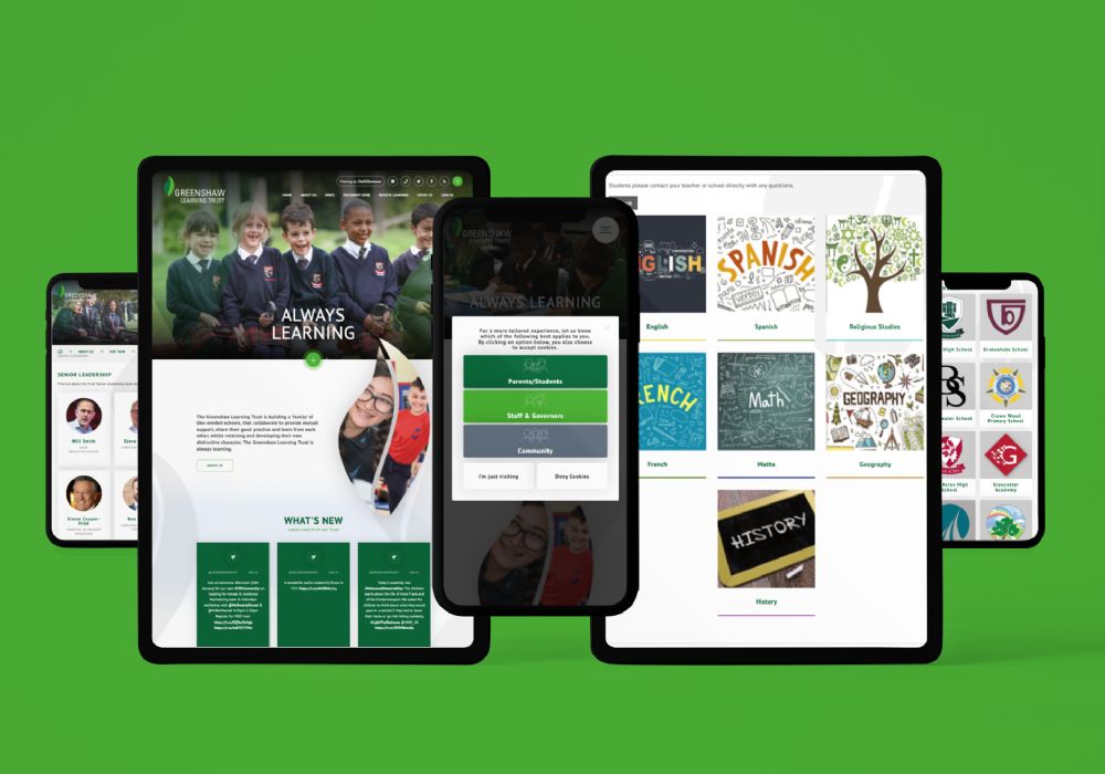
Greenshaw Learning Trust have been part of the e4education family for many years and we're proud to have recently partnered with them to share their 3000+ remote learning teacher-led video lessons with schools through their website (with the option for all schools to add this to their own website free of charge!).
Their new website has been a real pleasure to work on and includes an introductory pop-up to determine the best content for the user (depending on their relationship to the trust), a custom meet the team page with biographies for each staff member and an our schools page.
Maltby Learning Trust
Maltby Learning Trust is another longstanding e4education customer who we've had the privilege of working with for many years. Their dynamic new trust website features a uniquely shaped homepage, staff page and dedicated careers page. We also designed and built new websites for the 7 schools within the trust - creating a lead design for the primary and secondary sites, before cloning them to the other schools.
Congratulations to Maltby Academy, Sir Thomas Wharton Academy, Wath Academy, Ravenfield Primary Academy, Maltby Redwood Academy, Maltby Manor Academy and Maltby Lilly Hall Academy who also launched their fantastic new websites this month!
Mercia School
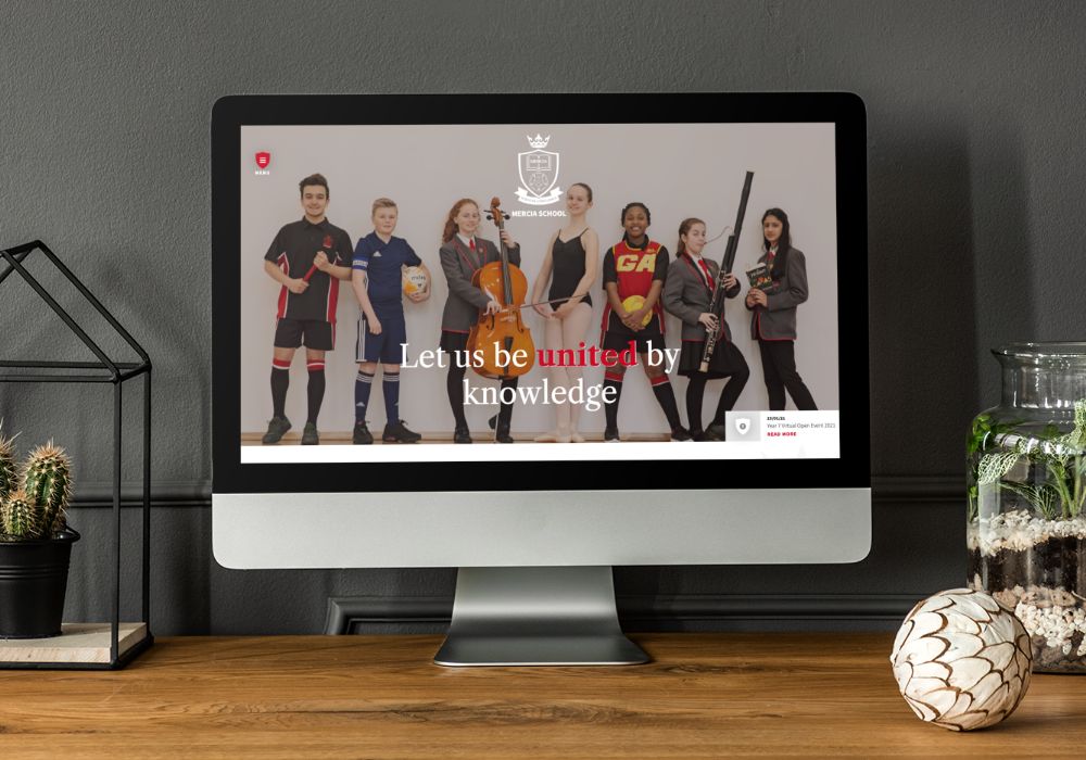
The professional themed photography and clean layout really make this website stand out from a crowd.
The menu sits on the left-hand side of the website, with the traditional burger menu creatively enhanced by a shield to match the school logo and we especially love the different 'where to find us' map which shows the location of the school in relation to local towns in the area.
These little elements add the perfect finishing touches to this Sheffield based secondary school website.
Hillcross Primary
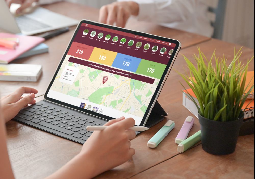
Hillcross Primary, another lovely existing customer, approached us in the Autumn Term as they wanted to revitalise their website design and improve the navigation structure for their existing stakeholders.
The new design is softer and much more engaging - with friendly fonts, hand-drawn elements and rows that flow into one another to give users access to key information such as news, events and house points. We love the USP on their map that says 'perfectly located in leafy Surrey, yet only a tube ride from London' and think the new design reflects their juxtaposition of city and country.
Isle Education Trust
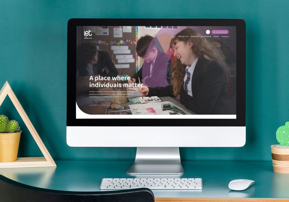
The brief for the new Isle Education Trust project was 'something clean and not too complex'.
We took their new branding as our inspiration and came up with a design for the trust and 3 schools which was simple yet effective, showcasing all the required information alongside modern curves and subtle colour palettes.
Each of the school designs follows the same theme for consistency but benefits from their own logo and colour scheme to add a touch of individuality.
Ferndale Primary School and Nursery
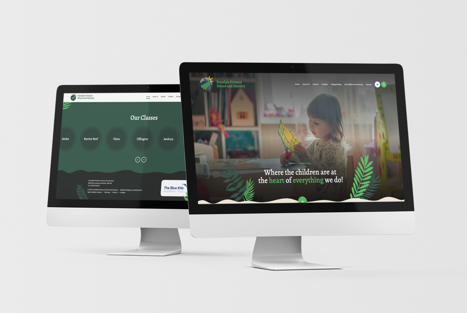
A stunning example of a primary bespoke website whereby a key element from the logo is used to great effect to lead the rest of the design. Our developers worked closely with our design team to add subtle animation of the fern leaves throughout the site which move into position on scroll alongside wavy lines and complementary colours to complete the look.
Grey Court School
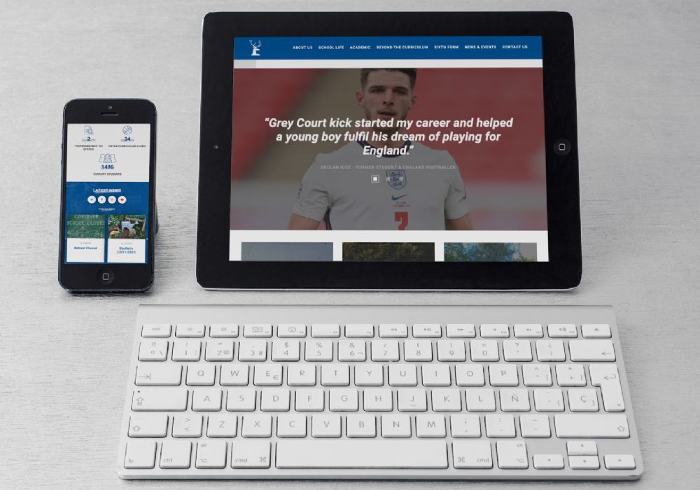
The first of several to launch, Grey Court School's new school website design is very eye-catching - with a fantastic hero video that sets the scene and provides an instant taste of life at the school.
The homepage testimonials, statistics and relevant quick links are ideal for engaging any prospective parent whilst the clear news feed, events calendar and streamlined navigation are perfect for returning visitors, parents and students to access the information they need quickly and efficiently.
Rutlish School
Where do we start with the fantastic new website design for Rutlish School?
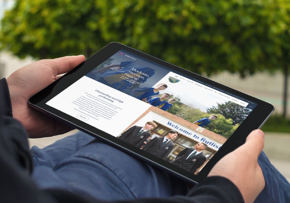
The homepage is a brilliant contrast of dark and light with natural, beautiful professional photography and clear call to actions that lead the visitor further into the website. Venturing further into the site, there is plenty of bespoke functionality with a scrolling history timeline, sixth form landing page and school life landing page.
Alongside their photography shoot, we also completed an interactive virtual tour - giving a real flavour of life at Rutlish School.
- Latest Live
- Websites
You might also like...
New year, new start
A new year (calendar or academic) is the chance for a fresh start. Goals are set, mistakes are relegated to the past and there’s generally a feeling of ‘newness’ in the air. Whether you’re looking for a new school website design, wanting to improve your school newsletter f...
DfE Compliance: Displaying your curriculum on your school website
Your school website is key source of information for parents, students, staff and the community, but there is certain content that you must always have visible on your website, and which will be checked by Ofsted inspectors prior to a visit. We have a full guide to all of these requirements which...

